Wednesday, December 19, 2012
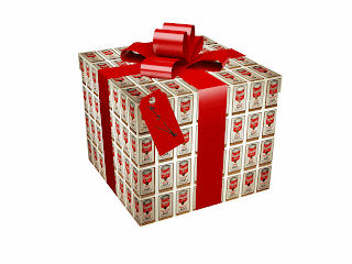
Christmas x Paintings
first I put Santa Claus soaring through the airs of Van Gogh's starry night, but then I felt bad for being sooooo cliche, so I made a second one with Andy Warhol's soup thingy as wraping paper.
Tuesday, December 18, 2012
spoooky signs
Check out these spooky signs. Lots of editing of text. I like all of them well enough. The bottom one has a sneaky easter egg that isn't all that sneaky.
Friday, December 14, 2012
Wednesday, December 12, 2012
Tuesday, December 11, 2012
Monday, December 10, 2012
Thursday, December 6, 2012
Wednesday, December 5, 2012
I wish for a big ole smooch
this genie is tryna give me a kiss!!
I got a little messed up because his forehead is different from my forehead.
I got a little messed up because his forehead is different from my forehead.
Tuesday, December 4, 2012
Friday, November 30, 2012
cine-a-gram
I wanted Alec to be blinking, but I decided that smiling would be funnier. It ended up looking more like he's chewing. That's alright with me. The stillness of his eyes is hilarious.
The hardest part of this project was dragging his face around to match the frames.
The hardest part of this project was dragging his face around to match the frames.
The idea was for a tennis ball to fall beside Katelynn, but I ended up switching the motion rolls so she could be angsty. I think it looks cool, very creepy. The hardest part was how many frames I needed to use in order to make it flow.
Tuesday, November 20, 2012
Logos for the Corporate
All these logos for companies whose names start with letters like K or A or W or I. You could arrange them to say "kawaii" which either means cute or scary in japanese and I on't remember which one so don't get mad at me if you're totally into japanese culture.Mr. Sands totally subtweeted me saying I was going to thank him later for teaching me how to be a corporate sellout but we'll see.
Wednesday, November 14, 2012
Book Cover
Pet Cemetery by Stephen King: this book iz about zawmbies. It is a dark and creepy book, and these covers are supposed to reflect that.
Thursday, October 25, 2012
STOP THE PRESSES!
Big & Beautiful magazine landed the interview of the year! The Hunchback of Notre Dame got a make-over, and 'she' is looking better than ever!
My overall feelings: This project is great for teaching the practical application of design. It was fun too.
This piece was slightly sucessful although I'm not sure it is believable. The magazine I decided to parody was targeted at sassy black women which isn't a stereotype I identify with even a little bit.
Friday, October 19, 2012
Friday, October 5, 2012
Squidpaul
Squidward truly raises the standard of beauty to an unrealistic level.
This is Ron Paul trying deperately to keep up the fashion trends of those darn kids.
Tuesday, October 2, 2012
Burn Victim
She used to be fat and ugly but I fixed her by trimming her face and limbs and burning her boobs. :-)
Monday, October 1, 2012
Friday, September 28, 2012
Spring Cycle
Unattainable, pointless "beauty."
I removed any trace of character from this poor woman's face, leaving behind only a monochromatic skintone that is truly unattainable, and in my personal opinion undesirable because I subscribe to a system of beauty stupid and pointless perpetuated by the media. I also gave her obnoxiously large eyes. For fun I changed her hair and eye color in a desperate attempt to give her some kind of personality. I still feel guilty. I am so sorry.
Friday, September 7, 2012
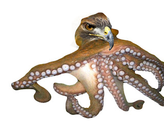
Hawktopus [newimal]
Obviously the best possible combonation of two animals would be a hawk and an octopus, mainly because of the awesome name that results... "Hawktopus." This is actually the sole reason I picked this combonation. The real challenge was making it work because it turns out a slippery water-dwelling creature and a feathered bird of prey have very different textures. I tried a couple times to make it right, you choose witch one you like best.
Uhggg this one is so unnatural looking, so I tried again.
He looks better, especially if you think of him as an evil genius with a giant brain.
Shiny TOYS
Look at all these shiny toys I made with the gradient tool. This was pretty cool and I can't wait to use them in a more practical application.
Thursday, September 6, 2012
Shiny DEATH
I was feeling morbid today so shiny death. The objective here was to make an object look like it was placed on a shiny surface. I copied the layer and then flipped it then applied a gradient to the copy. Mine ended up all awkward looking because the skull was at an angle, but I think it turned out alright.
Wednesday, September 5, 2012
Colorful Gandhi
This project was all about making a normal image colorful. I started with a generic profile of Gandhi because he is my favorite civil rights activist of all time. Next we used the threshold to make the picture black and white. I was familiar with this technique because I play with stencils a lot. On a layer I inserted above it I colored sporadically. After some blending and bluring I got the finished project. Pretty straightforward.
Tuesday, September 4, 2012
So Brave
It's election season! I bet you love hearing about these guys.Adding a pattern to an animals skin was actually a fairly easy process. First paste in the picture of your animal and lay your pattern on top of it. Transform to pattern to fit the area you want patetrned, then apply a darken filter. Presto; American flag faces.

SOOOOO BRAVE.
I tried really hard not to make political jokes when writing this. REALLY hard. I would have written a LOT more if I could've made fun of Ron Paul more.
Friday, August 31, 2012
Me breaking the laws (of physics hehe)
I tried a couple different things for this frame project because I was REALLY excited about it.
The idea was for me to climb into a trash can, and that was about it. I take any oppurntunity I can to climb in a trashcan with minimized judgement. In this version of the project I kept the trashcan as part of the image, so I'm kinda like Oscar the Grouch of this art gallery.
 But I also wanted to try a version where I was popping out of a painting in teh art gallery, so I removed the trashcan and my shadow and put it on top of a Pollock. I used to the transform tool to line up the images. There are very unrealistic proportions in this version but I think that just adds to it's absurdity.
  This was actually my original idea, and it was super easy. All I had to do was crop out the inside of the frame and then put a layer of water underneath the image.
This project was c00l as beans. <3
Thursday, August 30, 2012
Just think about how uncomfortable this would be.
This one started out with a risque picture of a girl licking her lips and a picture of a frog. Then we took the next logical step in any sane mind and put the frog inside her mouth. The magical wand was awesome because I didn't have to do any work at all to select the frog. I attempted to transform it so it was picking risque girls nose but wasn't entirely successful. Using the stamp tool I covered the entire frog with gross tongue texture, which actually gave me the idea that you could easily add pimples to a face using the stamp and a tongue. I ended up messing up a few hundred thousand times because of stupid layers. Layers are STUPID. [sorry layers; I really do understand your important purpose but you're very frustrating.] This taught me how to use the history tab as there were quite a few unnoticed mistakes during this project. [I BLAME LAYERS.] The drop shadow gave it some depth but to me the frog-tongue-thing still seems flat. Finally I used the burn and dodge tools to highlight/shadow the tongue.
Who ever thought of this project was seriously disturbed. They should seek help.
Who ever thought of this project was seriously disturbed. They should seek help.
What if you were eating your pancakes and then they ate you.
Watch out, THIS IS ONE ANGRY PANCAKE. He is mad because someone poured syrup all over him and he HATES to be sticky.
The first part of editing this photo involved using the liquify tool to make a pancake hole which was a challenge because I wasn't sure what shape and size to make the pancake hole. I like to say pancake hole. Once I overlayed the mouth I decreased it's opacity to that it blended better with the pancake hole. Also to help with blending, I manipulated the saturation levels. After all that was done I turned his blueberries into eyes using a couple macro images of eyes I found on the internet, then increased saturation to make them appear blood-shot. I hate how the butter is all distorted by squish. Lets hope no one notices.
I would not eat these pancakes. They are scary.
Subscribe to:
Posts (Atom)


 d
d


 mmmm pretty vector images. I traced a duck


